
> [!NOTE]
> Highlights information that users should take into account, even when skimming.

> [!TIP]
> Optional information to help a user be more successful.

> [!IMPORTANT]
> Crucial information necessary for users to succeed.

> [!WARNING]
> Critical content demanding immediate user attention due to potential risks.

> [!CAUTION]
> Negative potential consequences of an action.
(by bbauska)
You can edit your own version in one of two ways:
How to Use This Template
Copy and paste these code templates into your server for the desired product on your website. Or, add to github project.
Remember that you can adjust these to suit your needs. These templates are designed to be completely customizable.
As such, if you need to make any adjustments to these code snippets for a more optimized site, you're encouraged to do so.
Jump to a Template
<div class="container">
  <nav>
    <ul class="bar">
      <li><a href="#">Home</a></li>
      <li><a href="#">About</a></li>
      <li><a href="#" class="active">Contact</a></li>
      <li><a href="#">Careers</a></li>
    </ul>
  </nav>
</div>
.bar {
  background-color: rgb(245, 193, 97);
  width: 100%;
  height: 40px;
  display: flex;
  list-style: none;
  padding: 0;
}
.bar li {
  height: 100%;
  width: 100px;
  border-right: 1px solid rgb(235, 177, 69);
}
.bar li a {
  color: black;
  width: 100%;
  height: 100%;
  display: flex;
  align-items: center;
  justify-content: center;
  text-decoration: none;
}
.bar li a:hover {
  background-color: rgb(235, 177, 69);
}
.bar li a.active {
  background-color: rgb(165, 113, 16);
  color: white;
}

<div class="container">
  <nav>
    <ul class="bar">
      <li><a href="#">Home</a></li>
      <li><a href="#">About</a></li>
      <li><a href="#" class="active">Contact</a></li>
      <li><a href="#">Careers</a></li>
    </ul>
  </nav>
</div>
.bar {
  background-color: rgb(245, 193, 97);
  max-width: 200px;
  width: 100%;
  list-style: none;
  padding: 0;
}
.bar li {
  height: 100%;
  width: 100%;
  height: 50px;
  border-bottom: 1px solid rgb(235, 177, 69);
}
.bar li a {
  padding-left: 20px;
  text-align: left;
  color: black;
  max-width: 100%;
  height: 100%;
  display: flex;
  align-items: center;
  text-decoration: none;
}
.bar li a:hover {
  background-color: rgb(235, 177, 69);
}
.bar li a.active {
  background-color: rgb(165, 113, 16);
  color: white;
}

<div class="container">
  <nav>
    <ul class="bar">
      <li><a href="#" class="active">Home</a></li>
      <li class="has-dropdown">
        <a href="#">About</a>
        <ul class="dropdown">
          <li><a href="#">The Company</a></li>
          <li><a href="#">The Team</a></li>
        </ul>
      </li>
      <li class="has-dropdown">
        <a href="#">Contact</a>
        <ul class="dropdown">
          <li><a href="#">Email</a></li>
          <li><a href="#">Phone</a></li>
        </ul>
      </li>
      <li><a href="#">Careers</a></li>
    </ul>
  </nav>
</div>
* {
  box-sizing: border-box;
}
.bar {
  background-color: rgb(245, 193, 97);
  width: 100%;
  height: 40px;
  display: flex;
  list-style: none;
  padding: 0;
}
.bar li {
  height: 100%;
  width: 120px;
  border-right: 1px solid rgb(235, 177, 69);
}
.bar li a {
  color: black;
  width: 100%;
  height: 100%;
  display: flex;
  align-items: center;
  justify-content: center;
  text-decoration: none;
}
.bar .has-dropdown ul li a{
  padding: 12px 0;
}
.bar li a:hover {
  background-color: rgb(235, 177, 69);
}
.bar li a.active {
  background-color: rgb(165, 113, 16);
  color: white;
}
.dropdown {
  background-color: rgb(245, 193, 97);
  padding: 0;
  list-style: none;
  display: none;
}
.bar li.has-dropdown:hover .dropdown {
  display: block;
}

<div class="container">
  <ul class="breadcrumb">
    <li><a href="#" class="active">Home</a></li>
    <li><span></span></li>
    <li><a href="#">Products</a></li>
    <li><span></span></li>
    <li><a href="#">Computers</a></li>
    <li><span></span></li>
    <li><a href="#" class="unique">Laptops</a></li>
  </ul>
</div>
.breadcrumb {
  list-style: none;
  padding: 0;
  display: flex;
  font-size: 20px;
  justify-content: space-around;
  max-width: 450px;
}
.breadcrumb a {
  text-decoration: none;
  color: rgb(110, 110, 110);
  font-weight: bold;
}
.breadcrumb li span{
  color: gray;
}
.breadcrumb li a {
  color: orange;
  transition: color 300ms;
}
.breadcrumb li .unique {
  color: #000;
}
.breadcrumb li a:hover {
  color: rgb(176, 115, 0);
}

<button class="first">Hover over me</button>
.first {
  padding: 10px;
  font-size: 20px;
  background-color: black;
  color: white;
  border: none;
  cursor: pointer;
  box-shadow: 0 0 0 #ccc;
  transition: box-shadow 300ms, color 300ms;
}
.first:hover {
  color: yellow;
  box-shadow: 10px 10px 0 rgb(219, 219, 219);
}

<div class="tooltip">
  <span>Top</span>
  <div class="tooltip-text">This is the top of the tooltip</div>
</div>
body {
  margin: 60px;
}
.tooltip {
  position: relative;
  display: inline-block;
}
.tooltip-text {
  padding: 6px;
  background-color: #333;
  color: white;
  font-size: 12px;
  position: absolute;
  border-radius: 5px;
  width: 100px;
  text-align: center;
  display: inline-block;
  top: -45px;
  left: -12px;
  visibility: hidden;
}
.tooltip-text::after {
  content: "";
  position: absolute;
  left: 10px;
  bottom: -5px;
  width: 0;
  height: 0;
  border-left: 7px solid transparent;
  border-right: 7px solid transparent;
  border-top: 10px solid #333;
}
.tooltip:hover .tooltip-text {
  visibility: visible;
}
")
<div class="tooltip">
  <span>Right</span>
  <div class="tooltip-text">This is the right of the tooltip</div>
</div>
.tooltip {
  position: relative;
  display: inline-block;
}
.tooltip-text {
  padding: 6px;
  background-color: #333;
  color: white;
  font-size: 12px;
  position: absolute;
  border-radius: 5px;
  width: 100px;
  text-align: center;
  right: -120px;
  bottom: -7px;
  visibility: hidden;
}
.tooltip-text::after {
  content: "";
  position: absolute;
  left: -5px;
  bottom: 10px;
  width: 0;
  height: 0;
  border-top: 7px solid transparent;
  border-bottom: 7px solid transparent;
  border-right: 10px solid #333;
}
.tooltip:hover .tooltip-text {
  visibility: visible;
}
")
<div class="tooltip">
  <span>Bottom</span>
  <div class="tooltip-text"> This is the bottom of the tooltip
  </div>
</div>
.tooltip {
  position: relative;
  display: inline-block;
}
.tooltip-text {
  padding: 6px;
  background-color: #333;
  color: white;
  font-size: 12px;
  position: absolute;
  border-radius: 5px;
  width: 100px;
  text-align: center;
  display: inline-block;
  bottom: -46px;
  left: -10px;
  visibility: hidden;
}
.tooltip-text::after {
  content: "";
  position: absolute;
  left: 10px;
  top: -5px;
  width: 0;
  height: 0;
  border-left: 7px solid transparent;
  border-right: 7px solid transparent;
  border-bottom: 10px solid #333;
}
.tooltip:hover .tooltip-text {
  visibility: visible;
}
")
<div class="tooltip">
  <span>Left</span>
  <div class="tooltip-text">This is the left of the tooltip</div>
</div>
body {
  margin: 60px 130px;
}
.tooltip {
  position: relative;
  display: inline-block;
}
.tooltip-text {
  padding: 6px;
  background-color: #333;
  color: white;
  font-size: 12px;
  position: absolute;
  border-radius: 5px;
  width: 100px;
  text-align: center;
  left: -120px;
  bottom: -11px;
  visibility: hidden;
}
.tooltip-text::after {
  content: "";
  position: absolute;
  right: -5px;
  top: 12px;
  width: 0;
  height: 0;
  border-top: 7px solid transparent;
  border-bottom: 7px solid transparent;
  border-left: 10px solid #333;
}
.tooltip:hover .tooltip-text {
  visibility: visible;
}

")
<button class="second">Click me</button>
.second {
  width: 180px;
  height: 60px;
  display: flex;
  align-items: center;
  justify-content: center;
  font-size: 20px;
  background-color: rgb(85, 16, 16);
  color: white;
  border: none;
  cursor: pointer;
  transition: transform 150ms,
  font-size 150ms, color 150ms;
}
.second:active {
  background-color: rgb(63, 5, 5);
  font-size: 12px;
  transform: scale(1.3);
  box-shadow: 5px 5px 10px rgb(119, 119, 119);
}


<button class="third">Hover over me</button>
.third {
  border: none;
  background: none;
  width: 120px;
  height: 40px;
  cursor: pointer;
  position: relative;
  color: black;
  transition: color 500ms;
  overflow: hidden;
}
.third::after {
  content: "";
  background-color: #333;
  color: white;
  position: absolute;
  left: 0;
  bottom: -40px;
  width: 100%;
  height: 100%;
  transition: bottom 500ms;
  z-index: -1;
}
.third:hover {
  color: white;
}
.third:hover::after {
  bottom: 0;
}

<form>
  <div class="search">
    <input type="text" placeholder="Search products" />
    <button type="submit">Search</button>
  </div>
  <div class="align-center bottom">
    <div class="checkbox-block">
      <input
        type="checkbox"
        name="companies_included"
        id="companies_included"
      />
      <label for="companies_included"
        >Also search companies
      </label>
    </div>
    <div class="inline-flex radio-block">
      <span>Location</span>
      <div class="inline-flex align-center">
        <input
          type="radio"
          name="location"
          value="Your location"
          id="your_location"
        />
        <label for="your_location"> Your location </label>
      </div>
      <div class="inline-flex align-center">
        <input
          type="radio"
          name="location"
          value="Worldwide"
          id="worldwide"
        />
        <label for="worldwide"> Worldwide </label>
      </div>
    </div>
  </div>
</form>
.align-center {
  display: flex;
  align-items: center;
}
.inline-flex {
  display: inline-flex;
}
form {
  padding: 20px 0;
  max-width: 500px;
  border-bottom: 1px solid #ccc;
}
.search {
  display: flex;
  outline: 1px solid #cccccc;
}
.search > input {
  flex-grow: 1;
  border: 0;
  padding: 0.5rem 1rem;
  font-size: 1rem;
}
.search > input:focus {
  outline: none;
}
.search > button {
  padding: 0.8rem 2rem;
  border: 0;
  cursor: pointer;
  font-size: 1rem;
  background: #cccccc;
}
.bottom {
  margin-top: 10px;
  font-size: 14px;
}
.checkbox-block {
  display: flex;
  align-items: center;
  margin-right: 30px;
}
.checkbox-block input {
  margin-right: 5px;
  cursor: pointer;
}
.radio-block input {
  margin: 0 3px 0 10px;
}

<form>
  <div class="input-group">
    <label for="fname">Firstname</label>
    <input
      id="fname"
      name="fname"
      placeholder="Enter firstname"
      required="required"
    />
  </div>
  <div class="input-group">
    <label for="lname">Lastname</label>
    <input
      id="lname"
      name="lname"
      placeholder="Enter lastname"
      required="required"
    />
  </div>
  <div class="input-group">
    <label for="email">Email</label>
    <input
      id="email"
      type="email"
      name="email"
      placeholder="Enter your email"
    />
  </div>
  <div class="input-group">
    <label>Country</label>
    <select name="country" id="country" required="required">
      <option value="" selected="selected">Select country</option>
      <option value="Afghanistan">Afghanistan</option>
      <option value="Albania">Albania</option>
      <option value="Algeria">Algeria</option>
      <option value="American Samoa">American Samoa</option>
      <option value="Andorra">Andorra</option>
      <option value="Angola">Angola</option>
      <option value="Anguilla">Anguilla</option>
      <option value="Antarctica">Antarctica</option>
    </select>
  </div>
  <div class="input-group">
    <label for="message">Any message?</label>
    <textarea
      id="message"
      name="message"
      placeholder="Optional"
    ></textarea>
  </div>
  <div class="submit-group">
    <button type="submit">Submit form</button>
  </div>
</form>
* {
  box-sizing: border-box;
}
body {
  margin: 30px;
}
form {
  border: 1px solid #333;
  padding: 20px;
  max-width: 400px;
  margin: 0 auto;
  border-radius: 5px;
}
.input-group {
  display: flex;
  margin-bottom: 10px;
}
label {
  width: 100px;
}
input,
select,
textarea {
  flex: 1;
  padding: 3px 5px;
}
.submit-group {
  display: flex;
  align-items: center;
  justify-content: center;
  margin-top: 20px;
}
button {
  width: 100px;
  margin: 0 auto;
  background-color: black;
  color: white;
  border: none;
  padding: 10px;
  cursor: pointer;
  border-radius: 5px;
}

<form>
  <div>
    <span class="question">1. How did you hear about us?</span>
    <div class="radio-group">
      <div class="radio-item">
        <input type="radio" name="hear_about_us" id="twitter" />
        <label for="twitter">Twitter</label>
      </div>
      <div class="radio-item">
        <input type="radio" name="hear_about_us" id="facebook" />
        <label for="facebook">Facebook</label>
      </div>
      <div class="radio-item">
        <input type="radio" name="hear_about_us" id="other" />
        <label for="other">Other</label>
      </div>
    </div>
  </div>
  <div>
    <span class="question">2. Where do you live?</span>
    <select name="country" id="country" required="required">
      <option value="" selected="selected">Select country</option>
      <option value="Afghanistan">Afghanistan</option>
      <option value="Albania">Albania</option>
      <option value="Algeria">Algeria</option>
      <option value="American Samoa">American Samoa</option>
      <option value="Andorra">Andorra</option>
      <option value="Angola">Angola</option>
      <option value="Anguilla">Anguilla</option>
      <option value="Antarctica">Antarctica</option>
    </select>
  </div>
  <div>
    <span class="question">3. You age range</span>
    <div class="radio-group">
      <div class="radio-item">
        <input type="radio" name="age_range" id="lower" />
        <label for="lower">18-25</label>
      </div>
      <div class="radio-item">
        <input type="radio" name="age_range" id="middle" />
        <label for="middle">26-35</label>
      </div>
      <div class="radio-item">
        <input type="radio" name="age_range" id="higher" />
        <label for="higher">36 or more</label>
      </div>
    </div>
  </div>
  <div>
    <span class="question">4. Anything else we should know? </span>
    <textarea name="message"></textarea>
  </div>
  <div>
    <button class="submit-btn">Submit survey</button>
  </div>
</form>
* {
  box-sizing: border-box;
}
body {
  margin: 30px;
}
form {
  max-width: 400px;
}
form > div {
  margin-bottom: 20px;
}
.question {
  font-weight: bold;
  display: block;
  margin-bottom: 5px;
}
.radio-group,
select,
textarea {
  margin-left: 15px;
  width: 200px;
}
textarea {
  padding: 10px;
}
.radio-item {
  display: flex;
  align-items: center;
  margin-bottom: 3px;
}
.radio-item label {
  margin-left: 5px;
}
.radio-item input {
  margin: 0;
}
.submit-btn {
  margin-left: 15px;
  background-color: #555;
  border: 1px solid #555;
  color: white;
  padding: 10px;
  cursor: pointer;
}


<div class="images">
  <img onclick="openModal(0)" id="image0" />
  <img onclick="openModal(1)" id="image1" />
  <img onclick="openModal(2)" id="image2" />
  <img onclick="openModal(3)" id="image3" />
</div>
<div id="lightbox" class="lightbox">
  <button onclick="closeModal()" class="close-btn">
    Close
  </button>
  <div class="image-preview">
    <img id="preview-image" />
  </div>
  <div class="control-btns">
    <button onclick="control(-1)" class="control-left">
    </button>
    <button onclick="control(1)" class="control-left">
    </button>
  </div>
  <div id="modal-images-block" class="lightbox__images">
    <img onclick="openModal(0)" id="l-image0" />
    <img onclick="openModal(1)" id="l-image1" />
    <img onclick="openModal(2)" id="l-image2" />
    <img onclick="openModal(3)" id="l-image3" />
  </div>
</div>
* {
  box-sizing: border-box;
}
.images {
  display: grid;
  grid-template-columns: repeat(4, 1fr);
  grid-gap: 20px;
}
.images img {
  width: 100%;
  height: 100%;
  cursor: pointer;
}
.lightbox {
  position: absolute;
  left: 0;
  top: 0;
  padding: 0 50px 30px;
  width: 100%;
  height: 100vh;
  background-color: rgb(18, 7, 7);
  display: none;
  flex-direction: column;
}
.lightbox.visible {
  display: flex;
}
.lightbox .close-btn {
  width: 80px;
  align-self: flex-end;
  height: 40px;
  margin: 20px 0;
}
.lightbox .image-preview {
  width: 100%;
  margin: 0 auto;
  flex: 1;
  height: 100%;
  overflow: hidden;
  display: flex;
  flex-direction: column;
  align-items: center;
}
.image-preview img {
  width: 100%;
  height: 100%;
  object-fit: cover;
}
.control-btns {
  position: relative;
  top: -10px;
  margin: 0 auto;
}
.control-btns button {
  cursor: pointer;
}
.control-left {
  margin-right: 50px;
}
.lightbox__images {
  height: 300px;
  display: grid;
  grid-template-columns: repeat(4, 1fr);
  grid-gap: 20px;
  align-items: center;
}
.lightbox__images img {
  width: 100%;
  opacity: 0.3;
  cursor: pointer;
}
.lightbox__images img.active {
  width: 100%;
  opacity: 1;
}
const IMAGE0 =
"https://i.picsum.photos/id/229/400/200.jpg?hmac=ULnwo8IFtjR3PshWPNEvFWNU8Xwl_OIeUtVmZIQanhU"
const IMAGE1 =
"https://i.picsum.photos/id/154/400/200.jpg?hmac=uhKcJIPoFcq2xMC16yvZAwA8sTeIbThUr-Njq0DkhSU"
const IMAGE2 =
"https://i.picsum.photos/id/690/400/200.jpg?hmac=kOkDXkZEUaSUQviVm67apRu5EPMD_L0rHfKVt32iogQ"
const IMAGE3 =
"https://i.picsum.photos/id/633/400/200.jpg?hmac=-axbA3Zg3r_xPYOy7OdaIb5yTFDBKubd9LYJrnwpHeU"
const images = [IMAGE0, IMAGE1, IMAGE2, IMAGE3]
const image0 = document.getElementById("image0")
const image1 = document.getElementById("image1")
const image2 = document.getElementById("image2")
const image3 = document.getElementById("image3")
const lightbox = document.getElementById("lightbox")
const previewImg = document.getElementById("preview-image")
const modalImagesBlock = document.getElementById(
  "modal-images-block"
)
image0.src = IMAGE0
image1.src = IMAGE1
image2.src = IMAGE2
image3.src = IMAGE3
let activeId = null
previewImg.src = images[0]
const modalImagesElements =
modalImagesBlock.getElementsByTagName("img")
const modalImages = Object.values(modalImagesElements)
modalImages.forEach((imageElement, i) => {
  console.log(imageElement)
  imageElement.src = images[i]
})
function openModal(imgId) {
  if (activeId !== null) {
    modalImages[activeId].classList.remove("active")
  }
  activeId = imgId
  lightbox.classList.add("visible")
  previewImg.src = images[imgId]
  modalImages[imgId].classList.add("active")
}
function closeModal() {
  lightbox.classList.remove("visible")
}
function control(direction) {
  const prevId = activeId
  if (direction === 1) {
    // next
    activeId =
    activeId + 1 > images.length - 1
    ? // then go to the beginning
    (activeId = 0)
    : (activeId = activeId + 1)
  } else {
    // previous
    activeId =
    activeId - 1 < 0
    ? // then go to the end
    (activeId = images.length - 1)
    : activeId - 1
  }
  previewImg.src = images[activeId]
  modalImages[activeId].classList.add("active")
  modalImages[prevId].classList.remove("active")
}

<progress class="first" value="50" max="100"></progress>
.first {
  border-radius: 0;
  border: 2px solid purple;
  height: 30px;
  width: 250px;
}
.first::-webkit-progress-bar {
  background-color: white;
}
.first::-webkit-progress-value {
  background-color: purple;
}


<progress class="second" value="40" max="100"></progress>
{width="5.083333333333333in" height="0.7395833333333334in"}
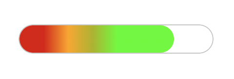
<progress class="second" value="80" max="100"></progress>
{width="5.0in" height="0.78125in"}
.second {
  overflow: hidden;
  border-radius: 15px;
  height: 30px;
  width: 200px;
}
.second::-webkit-progress-bar {
  border-radius: 15px;
  background-color: white;
  border: 1px solid #ccc;
}
.second::-webkit-progress-value {
  background-image: linear-gradient(
    90deg,
    hsl(0deg 91% 46%) 25px,
    hsl(41deg 100% 50%) 50px,
    hsl(63deg 100% 37%) 75px,
    rgb(85, 255, 0) 100px
  );
  border-radius: 15px;
}
<!DOCTYPE html>
<html lang="en">
<head>
  <title>Document</title>
  <link rel="stylesheet" href="style.css" />
</head>
<body>
  <div class="container">
    <h1>CSS Accordion</h1>
    <div class="accordion">
      <div class="tab">
        <input type="checkbox" id="tab1" />
        <label class="tab-label" for="tab1">Lorem ipsum 1</label>
        <div class="tab-content">
          Lorem ipsum dolor sit, amet consectetur adipisicing elit. Doloremque
          perferendis eligendi fugit quaerat consequatur fuga pariatur
          ratione, enim mollitia aut! Nobis maxime voluptas harum labore quos,
          tempore itaque quas excepturi.
        </div>
     </div>
    <div class="tab">
      <input type="checkbox" id="tab2" />
      <label class="tab-label" for="tab2">Lorem ipsum 2</label>
      <div class="tab-content">
        Lorem ipsum dolor sit, amet consectetur adipisicing elit. Doloremque
        perferendis eligendi fugit quaerat consequatur fuga pariatur
        ratione, enim mollitia aut! Nobis maxime voluptas harum labore quos,
        tempore itaque quas excepturi.
      </div>
    </div>
    <div class="tab">
      <input type="checkbox" id="tab3" />
      <label class="tab-label" for="tab3">Lorem ipsum 3</label>
      <div class="tab-content">
        Lorem ipsum dolor sit, amet consectetur adipisicing elit. Doloremque
        perferendis eligendi fugit quaerat consequatur fuga pariatur
        ratione, enim mollitia aut! Nobis maxime voluptas harum labore quos,
        tempore itaque quas excepturi.
      </div>
    </div>
  </div>
</div>
</body>
</html>
@import
"https://fonts.googleapis.com/css?family=Montserrat:400,700|Raleway:300,400";
body {
  color: #2c3e50;
  background: #ecf0f1;
  width: 100vw;
  padding: 0 1em 1em;
  font-family: "Raleway", sans-serif;
}
h1 {
  margin: 0;
  line-height: 2;
  text-align: center;
}
input {
  position: absolute;
  opacity: 0;
  z-index: -1;
}
/* Accordion styles */
.accordion {
  border-radius: 8px;
  width: 70vw;
  margin: 5rem auto 0;
  overflow: hidden;
  padding: 2rem 2.5rem;
  background-color: white;
  box-shadow: 0 4px 4px 2px rgba(0, 0, 0, 0.15);
}
.tab {
  width: 100%;
  color: #1a252f;
  overflow: hidden;
  margin: 1rem 0;
}
.tab-label {
  display: flex;
  justify-content: space-between;
  padding: 1rem;
  background: white;
  font-weight: bold;
  cursor: pointer;
}
.tab-label:hover {
background: #dce7ea;
}
.tab-label::after {
  content: "❯";
  width: 1em;
  height: 1em;
  text-align: center;
  transition: all 0.35s;
}
.tab-content {
  max-height: 0;
  padding: 0 1em;
  line-height: 2rem;
  color: #1a252f;
  background: white;
  transition: all 0.35s;
}
.tab-close {
  display: flex;
  justify-content: flex-end;
  padding: 1em;
  font-size: 0.75em;
  background: #2c3e50;
  cursor: pointer;
}
.tab-close:hover {
  background: #dce7ea;
}
input:checked + .tab-label {
  background: #dce7ea;
}
input:checked + .tab-label::after {
  transform: rotate(90deg);
}
input:checked ~ .tab-content {
  max-height: 100vh;
  padding: 1rem;
}
<!DOCTYPE html>
<html lang="en">
<head>
  <title>Document</title>
  <link rel="stylesheet" href="style.css" />
</head>
<body>
  <div class="container">
    <h1>CSS Accordion With Javascript</h1>
    <div class="accordion">
      <div class="tab">
        <input type="checkbox" id="tab1" />
        <label class="tab-label" for="tab1">Lorem ipsum 1</label>
        <div class="tab-content">
          Lorem ipsum dolor sit, amet consectetur adipisicing elit. Doloremque
          perferendis eligendi fugit quaerat consequatur fuga pariatur
          ratione, enim mollitia aut! Nobis maxime voluptas harum labore quos,
          tempore itaque quas excepturi.
        </div>
      </div>
      <div class="tab">
        <input type="checkbox" id="tab2" />
        <label class="tab-label" for="tab2">Lorem ipsum 2</label>
        <div class="tab-content">
          Lorem ipsum dolor sit, amet consectetur adipisicing elit. Doloremque
          perferendis eligendi fugit quaerat consequatur fuga pariatur
          ratione, enim mollitia aut! Nobis maxime voluptas harum labore quos,
          tempore itaque quas excepturi.
        </div>
      </div>
      <div class="tab">
        <input type="checkbox" id="tab3" />
        <label class="tab-label" for="tab3">Lorem ipsum 3</label>
        <div class="tab-content">
          Lorem ipsum dolor sit, amet consectetur adipisicing elit. Doloremque
          perferendis eligendi fugit quaerat consequatur fuga pariatur
          ratione, enim mollitia aut! Nobis maxime voluptas harum labore quos,
          tempore itaque quas excepturi.
        </div>
      </div>
    </div>
  </div>
  <script src="index.js"></script>
</body>
</html>
@import
"https://fonts.googleapis.com/css?family=Montserrat:400,700|Raleway:300,400";
body {
  color: #2c3e50;
  background: #ecf0f1;
  width: 100vw;
  padding: 0 1em 1em;
  font-family: "Raleway", sans-serif;
}
h1 {
  margin: 0;
  line-height: 2;
  text-align: center;
  color: #ff6873;
}
input {
  position: absolute;
  opacity: 0;
  z-index: -1;
}
/* Accordion styles */
.accordion {
  border-radius: 8px;
  width: 70vw;
  margin: 5rem auto 0;
  overflow: hidden;
  padding: 2rem 2.5rem;
  background-color: white;
  box-shadow: 0 4px 4px 2px rgba(0, 0, 0, 0.15);
}
.tab {
  width: 100%;
  color: #1a252f;
  overflow: hidden;
  margin: 1.4rem 0;
}
.tab-label {
  display: flex;
  justify-content: space-between;
  padding: 1rem;
  font-size: 1.2rem;
  color: #ff6873;
  font-weight: bold;
  cursor: pointer;
}
.tab-label::after {
  content: "❯";
  width: 1em;
  height: 1em;
  color: #ff6873;
  text-align: center;
  transition: all 0.35s;
}
.tab-content {
  max-height: 0;
  padding: 0 1em;
  line-height: 2rem;
  color: #1a252f;
  background: white;
  transition: all 0.35s;
}
.tab-close {
  display: flex;
  justify-content: flex-end;
  padding: 1em;
  font-size: 0.75em;
  background: #2c3e50;
  cursor: pointer;
}
.open-tab .tab-label::after {
  transform: rotate(90deg);
}
.open-tab .tab-content {
  max-height: 100vh;
  padding: 1rem;
}
const accordions = document.getElementsByClassName("tab");
  for (const accordion of accordions) {
    accordion.addEventListener("click", function (e) {
      e.preventDefault();
      accordion.classList.toggle("open-tab");
    });
  }
<!DOCTYPE html>
<html lang="en">
<head>
  <link rel="stylesheet" href="style.css" />
</head>
<body>
  <div class="container">
    <div class="box">
      <img src="./girl-with-guitar.jpeg" alt="img" /> <img
        src="./girl-with-guitar.jpeg"
        alt="img"
        class="translucent"
      />
    </div>
  </div>
</body>
</html>
*,
*::after,
*::before {
  margin: 0;
  padding: 0;
  box-sizing: border-box;
}
.container {
  display: flex;
  flex-flow: column nowrap;
  justify-content: space-around;
  align-items: center;
  min-height: 100vh;
  width: 100vw;
  background: #c8c7c7;
  font-family: "Roboto", sans-serif;
}
.box {
  width: 90%;
  height: 60%;
  display: flex;
  flex-flow: row nowrap;
  justify-content: space-around;
  align-items: center;
  margin: 1rem 0;
}
.box img {
  width: 48%;
}
.translucent {
  filter: opacity(35%);
}
<!DOCTYPE html>
<html lang="en">
<head>
  <link rel="stylesheet" href="style.css" />
</head>
<body>
  <div class="container">
    <div class="box">
      <img src="./girl-with-guitar.jpeg" alt="img" /> <img
        src="./girl-with-guitar.jpeg"
        alt="img"
        class="black-white"
      />
    </div>
  </div>
</body>
</html>
*,
*::after,
*::before {
  margin: 0;
  padding: 0;
  box-sizing: border-box;
}
.container {
  display: flex;
  flex-flow: column nowrap;
  justify-content: space-around;
  align-items: center;
  min-height: 100vh;
  width: 100vw;
  background: #c8c7c7;
  font-family: "Roboto", sans-serif;
}
.box {
  width: 90%;
  height: 60%;
  display: flex;
  flex-flow: row nowrap;
  justify-content: space-around;
  align-items: center;
  margin: 1rem 0;
}
.box img {
  width: 48%;
}
.black-white {
  filter: grayscale(100%);
}
<!DOCTYPE html>
<html lang="en">
<head>
  <link rel="stylesheet" href="style.css" />
</head>
<body>
  <div class="container">
    <div class="box">
      <img src="./girl-with-guitar.jpeg" alt="img" /> <img
        src="./girl-with-guitar.jpeg"
        alt="img"
        class="nineties-effect"
      />
    </div>
  </div>
</body>
</html>
*,
*::after,
*::before {
  margin: 0;
  padding: 0;
  box-sizing: border-box;
}
.container {
  display: flex;
  flex-flow: column nowrap;
  justify-content: space-around;
  align-items: center;
  min-height: 100vh;
  width: 100vw;
  background: #c8c7c7;
  font-family: "Roboto", sans-serif;
}
.box {
  width: 90%;
  height: 60%;
  display: flex;
  flex-flow: row nowrap;
  justify-content: space-around;
  align-items: center;
  margin: 1rem 0;
}
.box img {
  width: 48%;
}
.nineties-effect {
  filter: sepia(100%);
}
<!DOCTYPE html>
<html lang="en">
<head>
  <link rel="stylesheet" href="style.css" />
</head>
<body>
  <div class="container">
    <div class="box">
      <img src="./girl-with-guitar.jpeg" alt="img" /> <img
        src="./girl-with-guitar.jpeg"
        alt="img"
        class="hover-effect"
      />
    </div>
  </div>
</body>
</html>
*,
*::after,
*::before {
  margin: 0;
  padding: 0;
  box-sizing: border-box;
}
.container {
  display: flex;
  flex-flow: column nowrap;
  justify-content: space-around;
  align-items: center;
  min-height: 100vh;
  width: 100vw;
  background: #fafafa;
  /* background: #c8c7c7; */
  font-family: "Roboto", sans-serif;
}
.box {
  width: 90%;
  height: 60%;
  display: flex;
  flex-flow: row nowrap;
  justify-content: space-around;
  align-items: center;
  margin: 1rem 0;
}
.box img {
  width: 48%;
}
.hover-effect:hover {
  filter: grayscale(100%);
}
<!DOCTYPE html>
<html lang="en">
<head>
  <title>Document</title>
  <link rel="stylesheet" href="styles.css" />
</head>
<body>
  <!-- Tabbed image gallery -->
  <div class="tabbed-gallery">
    <div class="btn-row">
      <button class="btn active-btn">New York</button>
      <button class="btn">Honolulu</button>
      <button class="btn">Seoul</button>
    </div>
    <div id="New York" class="city">
      <img src="./img/new-york.jpeg" alt="New York" class="" />
      <p>New York City</p>
    </div>
    <div id="Honolulu" class="city hidden-city">
      <img src="./img/honolulu.jpeg" alt="Honolulu" class="" />
      <p>Honolulu</p>
    </div>
    <div id="Seoul" class="city hidden-city">
      <img src="./img/seoul.jpeg" alt="Seoul" class="" />
      <p>Seoul</p>
    </div>
  </div>
  <script src="index.js"></script>
</body>
</html>
@import
url("https://fonts.googleapis.com/css2?family=DynaPuff&display=swap");
* {
  padding: 0;
  margin: 0;
  box-sizing: border-box;
  font-family: "DynaPuff", cursive, sans-serif;
}
body {
  width: 100vw;
}
.tabbed-gallery {
  width: 80vw;
  margin: 6rem auto 0;
}
.btn-row {
  display: grid;
  grid-template-columns: repeat(3, 8rem);
  grid-template-rows: 3.5rem;
  column-gap: 8rem;
  justify-content: center;
  padding: 2rem auto;
  background-color: #1d1d27;
}
.btn {
  padding: 4px 2px;
  font-size: 1.2rem;
  border: none;
  outline: none;
  transition: all 300ms ease;
}
.btn:hover {
  cursor: pointer;
}
.active-btn {
  color: #fafafa;
  background-color: #4343f5;
}
.city {
  width: 100%;
  height: 75vh;
  position: relative;
  display: block;
  transition: all 400ms ease;
}
.hidden-city {
  display: none;
}
.city img {
  width: 100%;
  height: 100%;
  image-rendering: optimizeQuality;
}
.city p {
  position: absolute;
  bottom: 15%;
  left: 50%;
  transform: translate(-50%);
  text-align: center;
  color: #fafafa;
  font-size: 3.5rem;
}
const buttons = document.querySelectorAll(".btn");
const cities = document.querySelectorAll(".city");
function showCity(e, index) {
  // adds the hidden-city class to all image element and removes the
  // active-btn class from all buttons
  for (let i = 0; i < cities.length; i++) {
    cities[i].classList.add("hidden-city");
    buttons[i].classList.remove("active-btn");
  }
  // add the active-btn class to the clicked button
  e.target.classList.add("active-btn");
  // pick the right city and make it visible
  cities[index].classList.remove("hidden-city");
}
buttons.forEach((button, index) => {
  button.addEventListener("click", (e) => {
    showCity(e, index);
  });
});
<!DOCTYPE html>
<html lang="en">
<head>
  <title>Document</title>
  <link rel="stylesheet" href="styles.css" />
</head>
<body>
  <!-- Tabbed image gallery -->
  <div class="tabbed-gallery">
    <div class="btn-row">
      <button class="btn active-btn">
        <svg viewBox="0 0 24 24">
          <path
          d="M2,10.96C1.5,10.68 1.35,10.07 1.63,9.59L3.13,7C3.24,6.8 3.41,6.66
          3.6,6.58L11.43,2.18C11.59,2.06 11.79,2 12,2C12.21,2 12.41,2.06
          12.57,2.18L20.47,6.62C20.66,6.72 20.82,6.88
          20.91,7.08L22.36,9.6C22.64,10.08 22.47,10.69
          22,10.96L21,11.54V16.5C21,16.88 20.79,17.21
          20.47,17.38L12.57,21.82C12.41,21.94 12.21,22 12,22C11.79,22 11.59,21.94
          11.43,21.82L3.53,17.38C3.21,17.21 3,16.88 3,16.5V10.96C2.7,11.13
          2.32,11.14
          2,10.96M12,4.15V4.15L12,10.85V10.85L17.96,7.5L12,4.15M5,15.91L11,19.29V12.58L5,9.21V15.91M19,15.91V12.69L14,15.59C13.67,15.77
          13.3,15.76
          13,15.6V19.29L19,15.91M13.85,13.36L20.13,9.73L19.55,8.72L13.27,12.35L13.85,13.36Z"
          />
        </svg>
      </button>
      <button class="btn">
        <svg viewBox="0 0 24 24">
          <path
          d="M3,4A2,2 0 0,0 1,6V17H3A3,3 0 0,0 6,20A3,3 0 0,0 9,17H15A3,3 0 0,0
          18,20A3,3 0 0,0
          21,17H23V12L20,8H17V4M10,6L14,10L10,14V11H4V9H10M17,9.5H19.5L21.47,12H17M6,15.5A1.5,1.5
          0 0,1 7.5,17A1.5,1.5 0 0,1 6,18.5A1.5,1.5 0 0,1 4.5,17A1.5,1.5 0 0,1
          6,15.5M18,15.5A1.5,1.5 0 0,1 19.5,17A1.5,1.5 0 0,1 18,18.5A1.5,1.5 0 0,1
          16.5,17A1.5,1.5 0 0,1 18,15.5Z"
          />
        </svg>
      </button>
      <button class="btn">
        <svg viewBox="0 0 24 24">
          <path
          d="M11,9H13V7H11M12,20C7.59,20 4,16.41 4,12C4,7.59 7.59,4 12,4C16.41,4
          20,7.59 20,12C20,16.41 16.41,20 12,20M12,2A10,10 0 0,0 2,12A10,10 0 0,0
          12,22A10,10 0 0,0 22,12A10,10 0 0,0 12,2M11,17H13V11H11V17Z"
          />
        </svg>
      </button>
    </div>
    <div class="card">
      <h2 class="">Delivery</h2>
      <p>Lorem ipsum dolor, sit amet consectetur adipisicing elit.</p>
    </div>
    <div class="card hidden-card">
      <h2 class="">Shipping</h2>
      <p>Lorem ipsum dolor, sit amet consectetur adipisicing elit.</p>
    </div>
    <div class="card hidden-card">
      <h2 class="">Policy</h2>
      <p>Lorem ipsum dolor, sit amet consectetur adipisicing elit.</p>
    </div>
  </div>
  <script src="index.js"></script>
</body>
</html>
@import
"https://fonts.googleapis.com/css?family=Montserrat:400,700|Raleway:300,400";
* {
  padding: 0;
  margin: 0;
  box-sizing: border-box;
  font-family: "Raleway", sans-serif;
}
body {
  width: 100vw;
  background: #fff;
}
.tabbed-gallery {
  width: 80vw;
  height: 75vh;
  background-color: #e7e7e7;
  color: #1d1d27;
  margin: 6rem auto 0;
}
.btn-row {
  display: grid;
  grid-template-columns: repeat(3, 8rem);
  grid-template-rows: 3.5rem;
  column-gap: 10rem;
  justify-content: center;
  padding: 4rem auto !important;
  border-bottom: 2px solid #1d1d27;
}
.btn {
  border: none;
  outline: none;
  background-color: #fff;
}
.btn svg {
  width: 3rem;
  height: 2.2rem;
}
.btn:hover {
  cursor: pointer;
}
.active-btn svg {
  fill: #4343f5;
}
.card {
  width: 100%;
  height: 70vh;
  position: relative;
  display: block;
}
h2 {
  text-align: center;
  color: #4343f5;
  padding: 40px 0 20px 0;
  margin-top: 10rem;
  font-size: 4rem;
}
.card p {
  /* position: absolute;
  top: 30%;
  left: 50%;
  transform: translate(-50%); */
  margin: 0 auto;
  width: 60%;
  text-align: center;
  color: #1d1d27;
  font-size: 1.5rem;
}
.animate h2,
.animate p {
  -webkit-animation-name: content;
  animation-name: content;
  -webkit-animation-direction: normal;
  animation-direction: normal;
  -webkit-animation-duration: 0.5s;
  animation-duration: 0.5s;
  -webkit-animation-timing-function: ease-in-out;
  animation-timing-function: ease-in-out;
  -webkit-animation-iteration-count: 1;
  animation-iteration-count: 1;
  line-height: 1.4;
}
.hidden-card {
  display: none;
}
/* text slide up animation */
@-webkit-keyframes content {
  from {
    opacity: 0;
    transform: translateY(30%);
  }
  to {
    opacity: 1;
    transform: translateY(0%);
  }
}
@keyframes content {
  from {
    opacity: 0;
    transform: translateY(30%);
  }
  to {
    opacity: 1;
    transform: translateY(0%);
  }
}
const buttons = document.querySelectorAll(".btn");
const cards = document.querySelectorAll(".card");
function showCard(e, index) {
  // adds the hidden-city class to all city element and removes the
  // active-btn class from all buttons.
  for (let i = 0; i < cards.length; i++) {
    cards[i].classList.add("hidden-card");
    cards[i].classList.remove("animate");
    buttons[i].classList.remove("active-btn");
  }
  // adding the active-btn class to the clicked button.
  e.target.classList.add("active-btn");
  // picking the right card and make it visible.
  cards[index].classList.remove("hidden-card");
  cards[index].classList.add("animate");
}
buttons.forEach((button, index) => {
  button.addEventListener("click", (e) => {
    showCard(e, index);
  });
});
<!DOCTYPE html>
<html lang="en">
<head>
  <link rel="stylesheet" href="style.css" />
</head>
<body>
  <div class="carousel">
    <!-- Photo 1 -->
    <div class="card">
    <img src="./img/1.jpeg" alt="New York" class="" />
    <p>1/4</p>
  </div>
<!-- Photo 2 -->
<div class="card hidden-card">
  <img src="./img/2.jpeg" alt="New York" class="" />
  <p>2/4</p>
</div>
<!-- Photo 3 -->
<div class="card hidden-card">
  <img src="./img/3.jpeg" alt="New York" class="" />
  <p>3/4</p>
</div>
  <!-- Photo 4 -->
  <div class="card hidden-card">
    <img src="./img/4.jpeg" alt="New York" class="" />
    <p>4/4</p>
  </div>
  <div class="navigation">
    <button class="prev nav-btn"><</button>
    <button class="next nav-btn">></button>
  </div>
</div>
</body>
<script src="index.js"></script>
</html>
@import
url("https://fonts.googleapis.com/css2?family=DynaPuff&display=swap");
* {
  padding: 0;
  margin: 0;
  box-sizing: border-box;
  font-family: "DynaPuff", cursive, sans-serif;
}
html,
body {
  display: flex;
  align-items: center;
  justify-content: center;
  align-items: center;
  width: 100vw;
  height: 100vh;
  background-color: #3c3c3c;
}
.carousel {
  width: 80%;
  height: 75vh;
  position: relative;
  display: block;
  transition: all 400ms ease;
}
.card {
  display: block;
  height: 100%;
  width: 100%;
}
.card p {
  position: absolute;
  bottom: 12%;
  left: 50%;
  transform: translate(-50%);
  text-align: center;
  color: #fafafa;
  font-size: 3.5rem;
}
.card img {
  width: 100%;
  height: 100%;
  image-rendering: optimizeQuality;
  transition: all 0.3s ease;
  border: 8px solid white;
}
.hidden-card {
  display: none;
}
.carousel img {
  width: 100%;
  transition: all 0.3s ease;
  border: 8px solid white;
}
.navigation .prev {
  position: absolute;
  z-index: 10;
  font-size: 25px;
  top: 40%;
  left: 20px;
  font-weight: 700;
}
.navigation .next {
  right: 20px;
  position: absolute;
  font-size: 25px;
  z-index: 10;
  top: 40%;
}
.navigation .nav-btn {
  background: rgba(255, 255, 255, 0.55);
  border: none;
  outline: none;
  cursor: pointer;
  border-radius: 50%;
  width: 40px;
  height: 40px;
  display: flex;
  justify-content: center;
  align-items: center;
  padding: 10px;
  box-shadow: 2px 2px 10px rgba(0, 0, 0, 0.4);
}
.navigation .nav-btn:hover {
  background: white;
}
const prev = document.querySelector(".prev");
const next = document.querySelector(".next");
const images = document.querySelectorAll(".card");
const totalImages = images.length;
let index = 0;
prev.addEventListener("click", () => {
  nextImage("prev");
});
next.addEventListener("click", () => {
  nextImage("next");
});
function nextImage(direction) {
  if (direction === "next") {
    index++;
    if (index === totalImages) {
      index = 0;
    }
  } else if (direction === "prev") {
    if (index == 0) {
      index = totalImages - 1;
    } else {
      index--;
    }
  }
  for (let i = 0; i < images.length; i++) {
    images[i].classList.add("hidden-card");
  }
    images[index].classList.remove("hidden-card");
}
<!DOCTYPE html>
<html lang="en">
<head>
  <title>Document</title>
  <link rel="stylesheet" href="style.css" />
</head>
<body>
  <div class="carousel">
    <!-- Photo 1 -->
    <div class="card">
      <img src="./img/1.jpeg" alt="New York" class="" />
      <p>1/4</p>
    </div>
    <!-- Photo 2 -->
    <div class="card hidden-card">
      <img src="./img/2.jpeg" alt="New York" class="" />
      <p>2/4</p>
    </div>
    <!-- Photo 3 -->
    <div class="card hidden-card">
      <img src="./img/3.jpeg" alt="New York" class="" />
      <p>3/4</p>
    </div>
    <!-- Photo 4 -->
    <div class="card hidden-card">
      <img src="./img/4.jpeg" alt="New York" class="" />
      <p>4/4</p>
    </div>
    <div class="navigation">
      <button class="prev nav-btn"><</button>
      <button class="next nav-btn">></button>
    </div>
  </div>
</body>
<script src="index.js"></script>
</html>
@import
url("https://fonts.googleapis.com/css2?family=DynaPuff&display=swap");
* {
  padding: 0;
  margin: 0;
  box-sizing: border-box;
  font-family: "DynaPuff", cursive, sans-serif;
}
html,
body {
  display: flex;
  align-items: center;
  justify-content: center;
  align-items: center;
  width: 100vw;
  height: 100vh;
  background-color: #3c3c3c;
}
.carousel {
  width: 80%;
  height: 75vh;
  position: relative;
  display: block;
  transition: all 400ms ease;
}
.card {
  display: block;
  height: 100%;
  width: 100%;
}
.card p {
  position: absolute;
  bottom: 12%;
  left: 50%;
  transform: translate(-50%);
  text-align: center;
  color: #fafafa;
  font-size: 3.5rem;
}
.card img {
  width: 100%;
  height: 100%;
  image-rendering: optimizeQuality;
  transition: all 0.3s ease;
  border: 8px solid white;
}
.hidden-card {
  display: none;
}
.carousel img {
  width: 100%;
  transition: all 0.3s ease;
  border: 8px solid white;
}
.navigation .prev {
  position: absolute;
  z-index: 10;
  font-size: 25px;
  top: 40%;
  left: 20px;
  font-weight: 700;
}
.navigation .next {
  right: 20px;
  position: absolute;
  font-size: 25px;
  z-index: 10;
  top: 40%;
}
.navigation .nav-btn {
  background: rgba(255, 255, 255, 0.55);
  border: none;
  outline: none;
  cursor: pointer;
  border-radius: 50%;
  width: 40px;
  height: 40px;
  display: flex;
  justify-content: center;
  align-items: center;
  padding: 10px;
  box-shadow: 2px 2px 10px rgba(0, 0, 0, 0.4);
}
.navigation .nav-btn:hover {
  background: white;
}
const prev = document.querySelector(".prev");
const next = document.querySelector(".next");
const images = document.querySelectorAll(".card");
const totalImages = images.length;
let index = 0;
prev.addEventListener("click", () => {
  nextImage("prev");
});
next.addEventListener("click", () => {
  nextImage("next");
});
function nextImage(direction) {
  if (direction === "next") {
    index++;
    if (index === totalImages) {
      index = 0;
    }
  } else if (direction === "prev") {
  if (index == 0) {
    index = totalImages - 1;
    } else {
      index--;
    }
  }
  for (let i = 0; i < images.length; i++) {
    images[i].classList.add("hidden-card");
  }
  images[index].classList.remove("hidden-card");
}
setInterval(() => {
  nextImage("next");
}, 5000);
<!DOCTYPE html>
<html lang="en">
<head>
  <title>Document</title>
  <link rel="stylesheet" href="styles.css" />
</head>
<body>
  <div class="container hidden-container">
    <img src="./honolulu.jpeg" alt="Honolulu" class="img" />
    <button class="fixed-btn">Toggle image</button>
  </div>
  <script src="index.js"></script>
</body>
</html>
@import
url("https://fonts.googleapis.com/css2?family=DynaPuff&display=swap::400,700|Raleway:300,400");
* {
  padding: 0;
  margin: 0;
  box-sizing: border-box;
  font-family: "DynaPuff", cursive, sans-serif;
}
body {
  width: 100vw;
  min-height: 100vh;
  background: #fafafa;
}
.container {
  height: 100vh;
  width: 100%;
  display: flex;
  justify-content: center;
  align-items: center;
  position: relative;
}
.fixed-btn {
  border: none;
  outline: none;
  background-color: #1d1d27;
  color: #fafafa;
  padding: 1.5rem 1rem;
  font-size: 1.2rem;
  position: absolute;
  bottom: 10%;
  left: 50%;
  transform: translate(-50%);
  cursor: pointer;
}
.hidden-container {
  display: flex;
  justify-content: center;
  align-items: center;
}
.hidden-container img {
  transform: translateY(-2rem);
  width: 50%;
  height: 70vh;
}
.hidden {
  visibility: hidden;
  transition: all 400ms ease;
}
const toggleBtn = document.querySelector(".fixed-btn");
const hiddenImage = document.querySelector(".hidden-container img");
toggleBtn.addEventListener("click", (e) => {
  hiddenImage.classList.toggle("hidden");
});
<!DOCTYPE html>
<html lang="en">
<head>
  <title>Document</title>
  <link rel="stylesheet" href="styles.css" />
</head>
<body>
  <div class="container">
    <textarea id="text-area" cols="50" rows="20"> </textarea>
    <button class="fill-btn">Fill text</button>
  </div>
  <script src="index.js"></script>
</body>
</html>
@import
url("https://fonts.googleapis.com/css2?family=DynaPuff&display=swap::400,700|Raleway:300,400");
* {
  padding: 0;
  margin: 0;
  box-sizing: border-box;
  font-family: "DynaPuff", cursive, sans-serif;
}
body {
  width: 100vw;
  min-height: 100vh;
  background: #fafafa;
}
.container {
  height: 100vh;
  width: 100%;
  display: flex;
  justify-content: center;
  align-items: center;
  position: relative;
}
.fixed-btn {
  border: none;
  outline: none;
  background-color: #1d1d27;
  color: #fafafa;
  padding: 1.5rem 1rem;
  font-size: 1.2rem;
  position: absolute;
  bottom: 10%;
  left: 50%;
  transform: translate(-50%);
  cursor: pointer;
}
textarea {
  color: #1d1d27;
  font-size: 1.5rem;
  line-height: 2rem;
  letter-spacing: 0.1rem;
}
const fillBtn = document.querySelector(".fill-btn");
const textarea = document.getElementById("text-area");
fillBtn.addEventListener("click", () => {
  textarea.innerHTML =
  "Lorem ipsum dolor sit amet consectetur adipisicing elit. Magnam hic a
  vel perspiciatis asperiores, repudiandae rem nemo velit doloribus odit
  fugit, sed recusandae, minus voluptatem possimus autem molestias non
  aperiam\\n\\nLorem ipsum dolor sit amet consectetur adipisicing elit.
  Magnam hic a vel perspiciatis asperiores";
});
<!DOCTYPE html>
<html lang="en">
<head>
  <title>Document</title>
  <link rel="stylesheet" href="styles.css" />
</head>
<body>
  <div class="container bg-container">
    <button class="fixed-btn">New Color!</button>
  </div>
  <script src="index.js"></script>
</body>
</html>
@import
url("https://fonts.googleapis.com/css2?family=DynaPuff&display=swap::400,700|Raleway:300,400");
* {
  padding: 0;
  margin: 0;
  box-sizing: border-box;
  font-family: "DynaPuff", cursive, sans-serif;
}
body {
  width: 100vw;
  min-height: 100vh;
  background: #fafafa;
}
.container {
  height: 100vh;
  width: 100%;
  display: flex;
  justify-content: center;
  align-items: center;
  position: relative;
}
.fixed-btn {
  border: none;
  outline: none;
  background-color: #1d1d27;
  color: #fafafa;
  padding: 1.5rem 1rem;
  font-size: 1.2rem;
  position: absolute;
  bottom: 10%;
  left: 50%;
  transform: translate(-50%);
}
.bg-container {
  background-color: #4343f5;
}
const toggleBtn = document.querySelector(".bg-container .fixed-btn");
const container = document.querySelector(".bg-container");
const colors = [
  "#cdb4db",
  "#ffc8dd",
  "#ffafcc",
  "#bde0fe",
  "#a2d2ff",
  "#00b4d8",
  "#6f2dbd",
  "#f27059",
];
toggleBtn.addEventListener("click", (e) => {
  e.preventDefault();
  container.style.backgroundColor =
  colors[Math.floor(Math.random() * colors.length)];
});
<!-- Basic video element -->
<video src="./media/example-video.mp4"></video>
  <!-- Features standard controls to user -->
  <video controls src="./media/example-video.mp4"></video>
  <!-- Width and height in pixels -->
  <video width="500" height="500"
  src="./media/example-video.mp4"></video>
  <!-- Autoplay video -->
<video autoplay src="./media/example-video.mp4"></video>
<style>
/* Stylized video element */
video { /* Give video elements a red border */
  border-width: 5px;
  border-color: red;
}
</style>
<!-- Audio element with controls -->
<audio controls src="./media/example-audio.mp3"></audio>
<style>
/* Stylized audio element. Note: Only applicable if controls are
visible */
audio {
  border-width: 5px;
  border-radius: green;
}
</style>

/* Set entire page background to a color */
body {
  background: red;
}
/* To an image URL */
body {
  background: url("./images/image.png");
}
/*multiple backgrounds*/
body {
  background-image: url(rose.png), url(Android-Logo.png);
  background-position: right bottom, left top;
  background-repeat: no-repeat, repeat;
}
/* Transparent background */
body {
  background: green;
  opacity: 0.5; /* 50% opacity */
}
/* Position image in center */
body {
  background: center url("./images/image.png");
}
/* Repeat an image */
body {
  background: repeat-x url("./images/image.png");
}
/* Don't repeat an image */
body {
  background: no-repeat url("./images/image.png");
}
/* Set background for particular element with id 'my-element' */
#my-element {
  background: red;
}
/* background-blend-mode */
body{
  background:
  radial-gradient(
  red 40px,
  transparent 0,
  transparent 100%
),
radial-gradient(
  green 40px,
  transparent 0,
  transparent 100%
),
radial-gradient(
  blue 40px,
  transparent 0,
  transparent 100%
), snow;
background-blend-mode: multiply;
background-size: 100px 100px;
background-position: 0 0, 33px 33px, -33px -33px;
}
/* This demonstrates how a background image filter can be added */
body{
  background-image:
  conic-gradient(red, white, green, yellow, brown),
  url(rose.png);
  background-blend-mode: color-burn;
}
<div class="container">
  <div class="square left-gradient"></div>
  <div class="square right-gradient"></div>
  <div class="square diagonal-gradient"></div>
  <div class="square angled-gradient"></div>
  <div class="square rainbow-gradient"></div>
  <div class="square transparent-gradient"></div>
  <div class="square repeating-gradient"></div>
  <div class="square conic-gradient"></div>
  <div class="square radial-gradient"></div>
  <div class="square multiple-gradient"></div>
</div>
<style>
.left-gradient {
  background: linear-gradient(to left, red, green);
}
/* Right-to-left gradient */
.right-gradient {
  background: linear-gradient(to right, red, green);
}
/* Diagonal gradient */
.diagonal-gradient {
  background: linear-gradient(to top left, red, green);
}
/* Angled (33 degree) gradient */
.angled-gradient {
  background: linear-gradient(33deg, red, green);
}
/* Multi-colored gradient */
.rainbow-gradient {
  background: linear-gradient(to left, red, orange, yellow, green, blue, indigo, violet);
}
/* Partially transparent gradient */
.transparent-gradient {
  background: linear-gradient(to left, red, green);
  opacity: 0.5;
}
.radial-gradient {
  background: radial-gradient(white, yellow, brown);
}
.conic-gradient {
  background: conic-gradient(red, white, green, yellow, brown);
  height: 400px;
  width: 400px;
}
.repeating-gradient {
  height: 400px;
  background-image: repeating-linear-gradient(white, yellow, brown);
}
.multiple-gradient {
  background-image:
  linear-gradient(to left, red, green), radial-gradient(white, yellow, brown);
}
</style>
<div class="container">
  <div class="square hidden-overflow">
    Lorem ipsum dolor sit amet, consectetur adipisicing elit, sed do eiusmod
    tempor incididunt ut labore et dolore magna aliqua. Ut enim ad minim
    eniam, quis nostrud exercitation ullamco laboris nisi ut aliquip ex ea commodo
    consequat. Duis aute irure dolor in reprehenderit in voluptate velit esse
    cillum dolore eu fugiat nulla pariatur. Excepteur sint occaecat cupidatat non
    proident, sunt in culpa qui officia deserunt mollit anim id est laborum.
  </div>
  <div class="square scroll-overflow">
    Lorem ipsum dolor sit amet, consectetur adipisicing elit, sed do eiusmod
    tempor incididunt ut labore et dolore magna aliqua. Ut enim ad minim veniam,
    quis nostrud exercitation ullamco laboris nisi ut aliquip ex ea commodo
    consequat. Duis aute irure dolor in reprehenderit in voluptate velit esse
    cillum dolore eu fugiat nulla pariatur. Excepteur sint occaecat cupidatat non
    proident, sunt in culpa qui officia deserunt mollit anim id est laborum.
  </div>
  <div class="square auto-overflow">
    Lorem ipsum dolor sit amet, consectetur adipisicing elit, sed do eiusmod
    tempor incididunt ut labore et dolore magna aliqua. Ut enim ad minim veniam,
    quis nostrud exercitation ullamco laboris nisi ut aliquip ex ea commodo
    consequat. Duis aute irure dolor in reprehenderit in voluptate velit esse
    cillum dolore eu fugiat nulla pariatur. Excepteur sint occaecat cupidatat non
    proident, sunt in culpa qui officia deserunt mollit anim id est laborum.
  </div>
  <div class="square visible-overflow">
    Lorem ipsum dolor sit amet, consectetur adipisicing elit, sed do eiusmod
    tempor incididunt ut labore et dolore magna aliqua. Ut enim ad minim veniam,
    quis nostrud exercitation ullamco laboris nisi ut aliquip ex ea commodo
    consequat. Duis aute irure dolor in reprehenderit in voluptate velit esse
    cillum dolore eu fugiat nulla pariatur. Excepteur sint occaecat cupidatat non
    proident, sunt in culpa qui officia deserunt mollit anim id est laborum.
  </div>
  <div class="square visible-overflow-x">
    <ol>
      <li>John</li>
      <li>Doe</li>
      <li>Mike</li>
      <li>Gee</li>
      <li>Stella</li>
      <li>Jane</li>
      <li>Mary</li>
      <li>Lawrence</li>
      <li>Nancy</li>
      <li>Kennedy</li>
      <li>Stanely</li>
    </ol>
  </div>
  <div class="square hidden-overflow-y">
    <ol>
      <li>John</li>
      <li>Doe</li>
      <li>Mike</li>
      <li>Gee</li>
      <li>Stella</li>
      <li>Jane</li>
      <li>Mary</li>
      <li>Lawrence</li>
      <li>Nancy</li>
      <li>Kennedy</li>
      <li>Stanely</li>
    </ol>
  </div>
</div>
<div class="container" style="margin-top: 10%">
<div class="rectangle overflow-wrap-normal">
</div>
<div class="rectangle overflow-wrap-break">
<div>
  <div class="rectangle-max-height visible-overflow-x">
    Lorem ipsum dolor sit amet, consectetur adipisicing elit, sed do eiusmod
    tempor incididunt ut labore et dolore magna aliqua. Ut enim ad minim
    veniam, quis nostrud exercitation ullamco laboris nisi ut aliquip ex ea
    commodo consequat. Duis aute irure dolor in reprehenderit in voluptate
    velit esse cillum dolore eu fugiat nulla pariatur. Excepteur sint
    occaecat cupidatat non proident, sunt in culpa qui officia deserunt
    mollit anim id est laborum.
  </div>
</div>
<div class="rectangle-max-width visible-overflow">
</div>
<style type="text/css">
/* visible overflow */
.container {
  display: flex;
}
.square {
  width: 150px;
  height: 150px;
  background-color: lightblue;
  margin: 1em;
  display: flex;
  flex-direction: column;
  justify-content: center;
  align-items: center;
}
.rectangle {
  width: 300px;
  height: 50px;
  background-color: lightblue;
  margin: 1em;
  justify-content: center;
  align-items: center;
}
.rectangle-max-height{
  width: 250px;
  max-height: 50px;
  background-color: lightblue;
  margin: 1em;
  justify-content: center;
  align-items: center;
}
.rectangle-max-width{
  max-width: 350px;
  max-height: 20px;
  background-color: lightblue;
  margin: 1em;
}
.visible-overflow {
  overflow: visible;
}
.hidden-overflow {
  overflow: hidden;
}
.scroll-overflow {
  overflow: scroll;
}
.auto-overflow {
  overflow: auto;
}
.visible-overflow-x {
  overflow-x: visible;
}
.visible-overflow-y {
  overflow-y: visible;
}
.hidden-overflow-y {
  overflow-y: hidden;
}
.overflow-wrap-normal {
  overflow-wrap: normal;
}
.overflow-wrap-break {
  overflow-wrap: break-word;
}
</style>
<html>
<body>
<div class="container">
  <!-- Example 1: Changing Color -->
  <div class="green-square green-red-alternate"></div>
  <!-- Example 2: Moving across the screen -->
  <div class="black-circle vertical-alternate-fast"></div>
  <!-- Example 3: On hover, changing color-->
  <div class="green-rounded-square color-transition"></div>
</div>
</body>
</html>
  <style>
    .container {
      display: flex;
      flex-direction: row;
      overflow: hidden;
    }
    /* Example 1: Changing Color */
    .green-square {
      width: 200px;
      height: 200px;
      background-color: green;
    }
    .green-red-alternate {
      animation-name: to-red;
      animation-duration: 3s;
      animation-iteration-count: infinite;
      animation-direction: alternate;
    }
    @keyframes to-red {
      from {
        background-color: green;
      }
      to {
        background-color: red;
      }
    }
    /* Example 2: Moving across the screen */
  .black-circle {
    width: 200px;
    height: 200px;
    border-radius: 100%;
    background-color: black;
  }
  /* Example 2a: Moving horizontal slowly */
  .horizontal-alternate {
    animation-name: left-to-right;
    animation-duration: 3s;
    animation-iteration-count: infinite;
    animation-direction: alternate;
  }
  @keyframes left-to-right {
    from {
      margin-left: 0%;
    }
    to {
      margin-left: 100%;
    }
  }
  /* Example 2b: Moving vertically quickly */
  .vertical-alternate-fast {
    animation-name: top-to-bottom;
    animation-duration: 1s;
    animation-iteration-count: infinite;
    animation-direction: alternate;
  }
  @keyframes top-to-bottom {
    from {
      margin-top: 0%;
    }
    to {
      margin-top: 100%;
    }
  }
  /* Example 3: Animation on hover */
  .green-rounded-square {
    width: 200px;
    height: 200px;
    background-color: green;
    border-radius: 1em;
  }
  .color-transition:hover {
    animation-name: to-red;
    animation-duration: 3s;
    animation-iteration-count: infinite;
    animation-direction: alternate;
  }
  </style>
Email signature gallery templates (google mail)

Email signature gallery template (MS outlook)
AI template #1

AI template #2

AI template #3

AI template #4
github readme template #1

github readme template #2

github readme template #3

github readme template #4
github html skeleton template #1

github html skeleton template #2
This Bootstrap plugin allows you to generate a table of contents for any page, based on the heading elements (<h1>, <h2>, etc.). It is meant to emulate the sidebar you see on the Bootstrap v3 documentation site.
This page is an example of the plugin in action – the table of contents you see on the left (or top, on mobile) was automatically generated, without having to manually keep all of the navigation items in sync with the headings.
IDs are created on the heading elements if they aren’t already present. Unicode characters are supported. While IDs are added for developer convenience, you’ll want to do this on the backend / through your static site generator so that your users can link to the anchors via URL fragments.
<!-- add after bootstrap.min.css -->
<link
  rel="stylesheet"
  href="https://cdn.rawgit.com/afeld/bootstrap-toc/v1.0.1/dist/bootstrap-toc.min.css"
/>
<!-- add after bootstrap.min.js or bootstrap.bundle.min.js -->
<script src=
"https://cdn.rawgit.com/afeld/bootstrap-toc/v1.0.1/dist/bootstrap-toc.min.js"></script>
Simplest.
<nav id="toc" data-toggle="toc"></nav>
You can put this wherever you like on the page. Since this plugin leverages Bootstrap’s Scrollspy plugin, you will also need to add a couple attributes to the <body>:
<body data-spy="scroll" data-target="#toc"></body>
<body data-bs-spy="scroll" data-bs-target="#toc"></body>
If you need customization.
If you prefer to create your navigation element another way (e.g. within single-page apps), you can pass a jQuery object into Toc.init().
<nav id="toc"></nav>
$(function () {
  var navSelector = "#toc";
  var $myNav = $(navSelector);
  Toc.init($myNav);
  $("body").scrollspy({
    target: navSelector,
  });
});
See the Scrollspy documentation for more information about initializing that plugin.
When calling Toc.init(), you can either pass in the jQuery object for the <nav> element (as seen above), or an options object:
Toc.init({
  $nav: $("#myNav"),
  // ...
});
All options are optional, unless otherwise indicated.
| option | type | notes |
| $nav | jQuery Object | (required) The element that the navigation will be created in. |
| $scope | jQuery Object | The element where the search for headings will be limited to, or the list of headings that will be used in the navigation. Defaults to $(document.body). |
By default, the plugin chooses the top-level navigation items by searching for headings at the first heading level, then works its way down (<h1>, then <h2>, etc.) It will stop when it finds the first set of headings where more than one exists at that level. For example:
<h1>The title</h1>
<h2>Some sub-title</h2>
...
<h3>Section 1</h3>
<h4>Subsection A</h4>
...
<h4>Subsection B</h4>
...
<h3>Section 2</h3>
The plugin would see there’s only one <h1>, then that there’s only one <h2>, then stop when it sees there’s more than one <h3>. The identified level becomes the top-level navigation items in the Table of Contents, and any headings under those (the <h4>s in this case) would be the second-level navigation.
This behavior can be customized with the $scope option. That jQuery object can be created with one or more selectors to force certain headings to be used.
In the above example, let’s say that you wanted the navigation to only contain the Subsections. You could pass:
Toc.init({
  $scope: $("h4"),
  // ...
});
and the resulting Table of Contents would only contain:
By default, Bootstrap TOC will use the text from the heading element in the table of contents. If you want to customize what is displayed, add a data-toc-text attribute to the heading with the desired text. For example:
<h2 data-toc-text="Short text">Longer text</h2>
displays “Longer text” as the heading, but “Short text” in the sidebar.
To prevent a particular heading from being added to the table of contents, add a data-toc-skip boolean attribute to the heading.
<h2 data-toc-skip>Some heading you don't want in the nav</h2>
This plugin isn’t opinionated about where it should be placed on the page, but a common use case is to have the table of contents created as a “sticky” sidebar.
<body data-spy="scroll" data-target="#toc">
  <div class="container">
    <div class="row">
      <!-- sidebar, which will move to the top on a small screen -->
      <div class="col-sm-3">
        <nav id="toc" data-toggle="toc" class="sticky-top"></nav>
      </div>
      <!-- main content area -->
      <div class="col-sm-9">...</div>
    </div>
  </div>
</body>
You may also want to include this in your stylesheet:
nav[data-toggle="toc"] {
  top: 42px;
}
/* small screens */
@media (max-width: 768px) {
  /* override stickyness so that the navigation does not follow scrolling */
  nav[data-toggle="toc"] {
    margin-bottom: 42px;
    position: static;
  }
  /* PICK ONE */
  /* don't expand nested items, which pushes down the rest of the page when navigating */
  nav[data-toggle="toc"] .nav .active .nav {
    display: none;
  }
  /* alternatively, if you do want the second-level navigation to be shown (as
     seen on this page on mobile), use this */
  /*
  nav[data-toggle='toc'] .nav .nav {
    display: block;
  }
  */
}
Note: if you’re upgrading from version <= 0.4.1 to 1.0.0+, these have changed.
Bootstrap Template #1
Bootstrap Template #2
Bootstrap Template #3
Bootstrap Template #4
Bootstrap Template #5
Login Form Template example 1 goes here

Login Form Template example 2 goes here

Login Form Template example 3 goes here

Login Form Template example 4 goes here